Conversion optimisation
Form design: User testing and iterating to increase donations by over 20%
I led UX efforts to optimise Tearfund's donation journey, including an accessible, user-friendly forms redesign and an in-depth A/B testing program with Conversion.com.

I redesigned Tearfund's forms from the ground up, using a user-centred approach - leaning on best practices, data insights, usability testing and ongoing iteration.
Situation /
From 2018 to 2024 I led UX design at Tearfund, starting as the organisation’s first UX designer. In 2022 when the UX team expanded I was promoted to Principal UX Designer, managing two other designers.
I redesigned Tearfund’s websites and created a new design system - and post-launch, I was responsible for iterating on these.
Usability testing highlighted many issues with the existing forms, pre-redesign:
Many elements failed WCAG 2.1 AA accessibility standards.
Significant usability issues found, impacting form completion.
Designs hadn’t gone through testing with users.
Missing important contextual content.
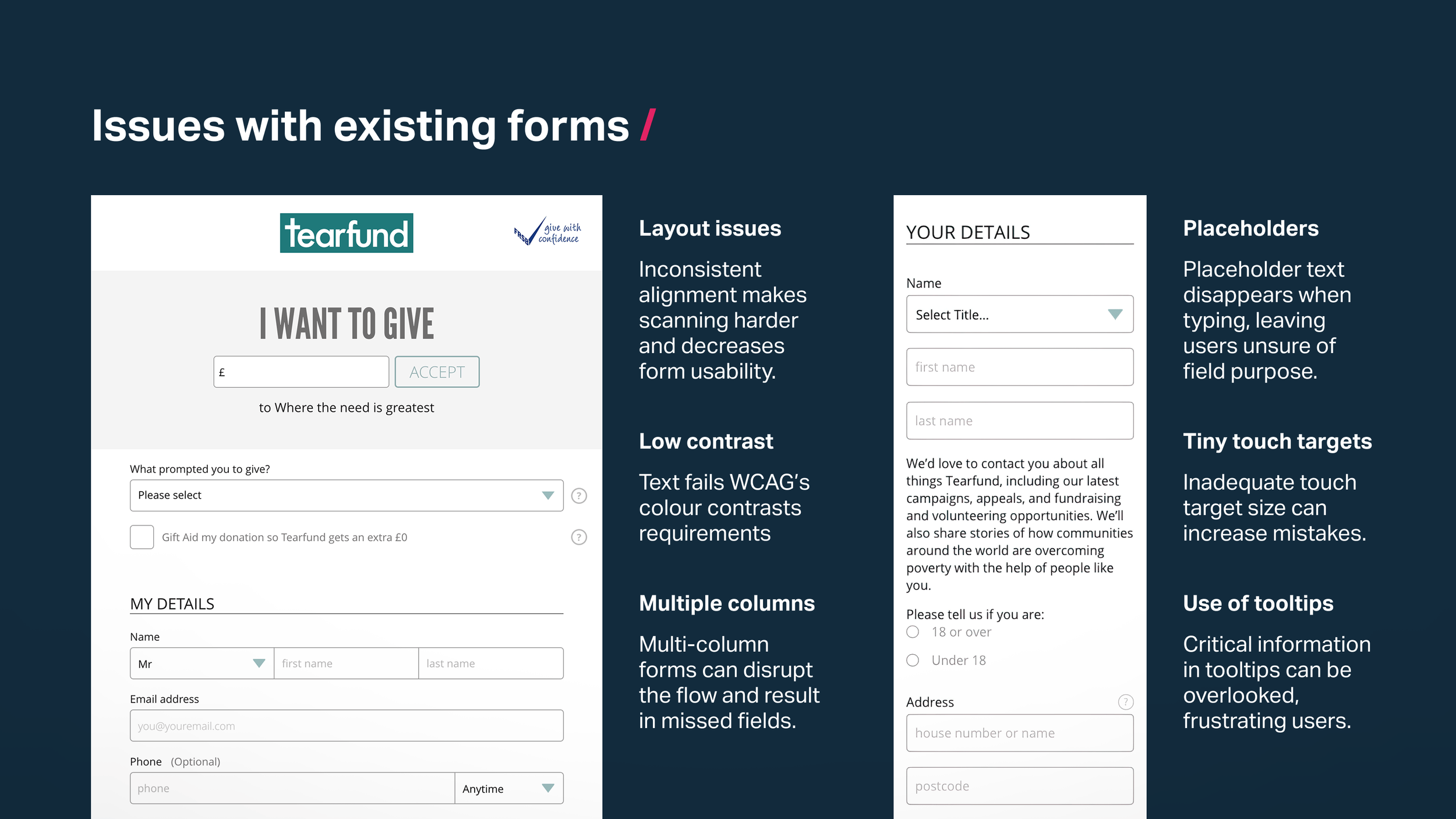
Before I led a user-centred redesign of Tearfund's donation forms, there were many issues, which impacted usability, accessibility and content.
Task /
The highest priority journey was donating to Tearfund on the supporter-facing website, tearfund.org - with a strong focus on regular donations over one-off.
This case study outlines a few of the different ways I approached the optimisation of this journey, helping improve in key areas and increase conversion:
Lead a complete redesign of Tearfund’s donation forms.
Maximise GiftAid completions.
Increase trust by demonstrating ‘Where your money goes’.
Add bespoke content to forms, including text and imagery.
Provide UX and accessibility expertise on an extensive A/B testing program in partnership with Conversion.com.
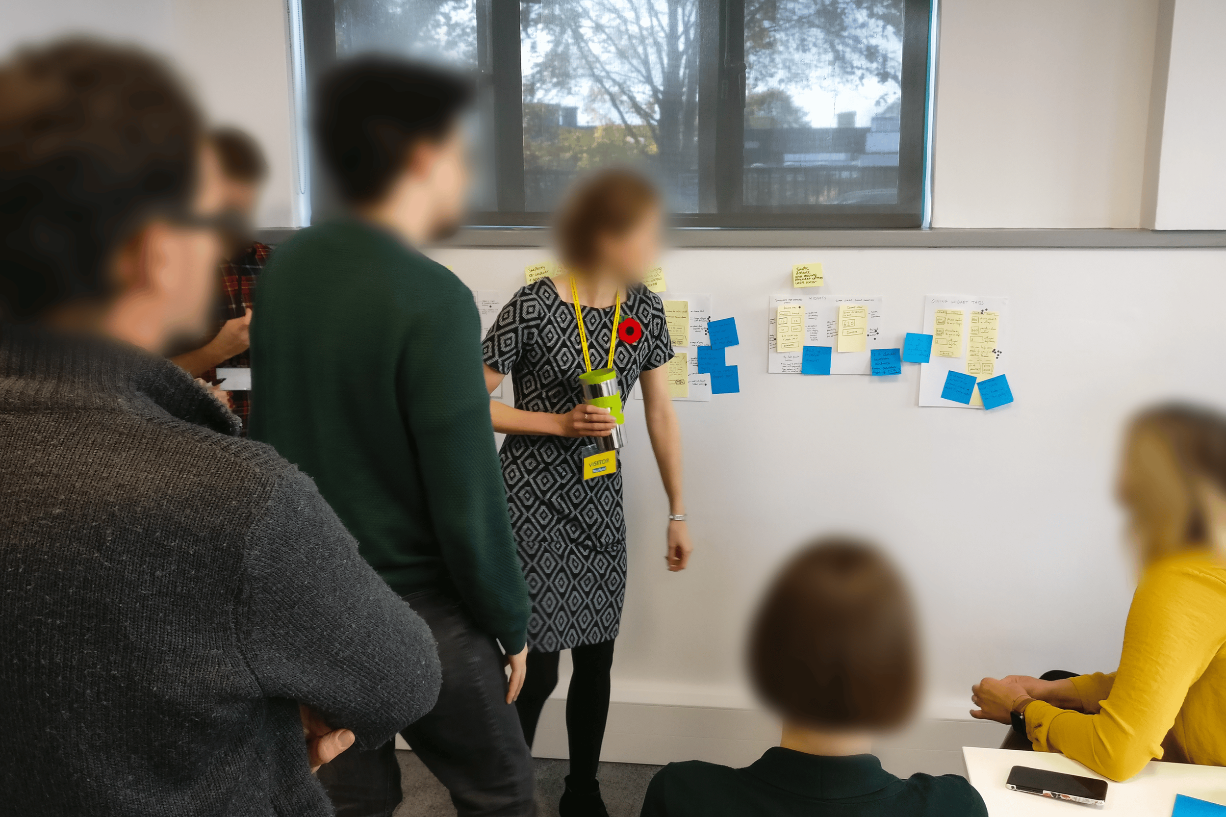
Participating in a co-design workshop early on in the website redesign project, creating a wireframe of the main donate page on mobile - with the aim of creating a prototype to test.
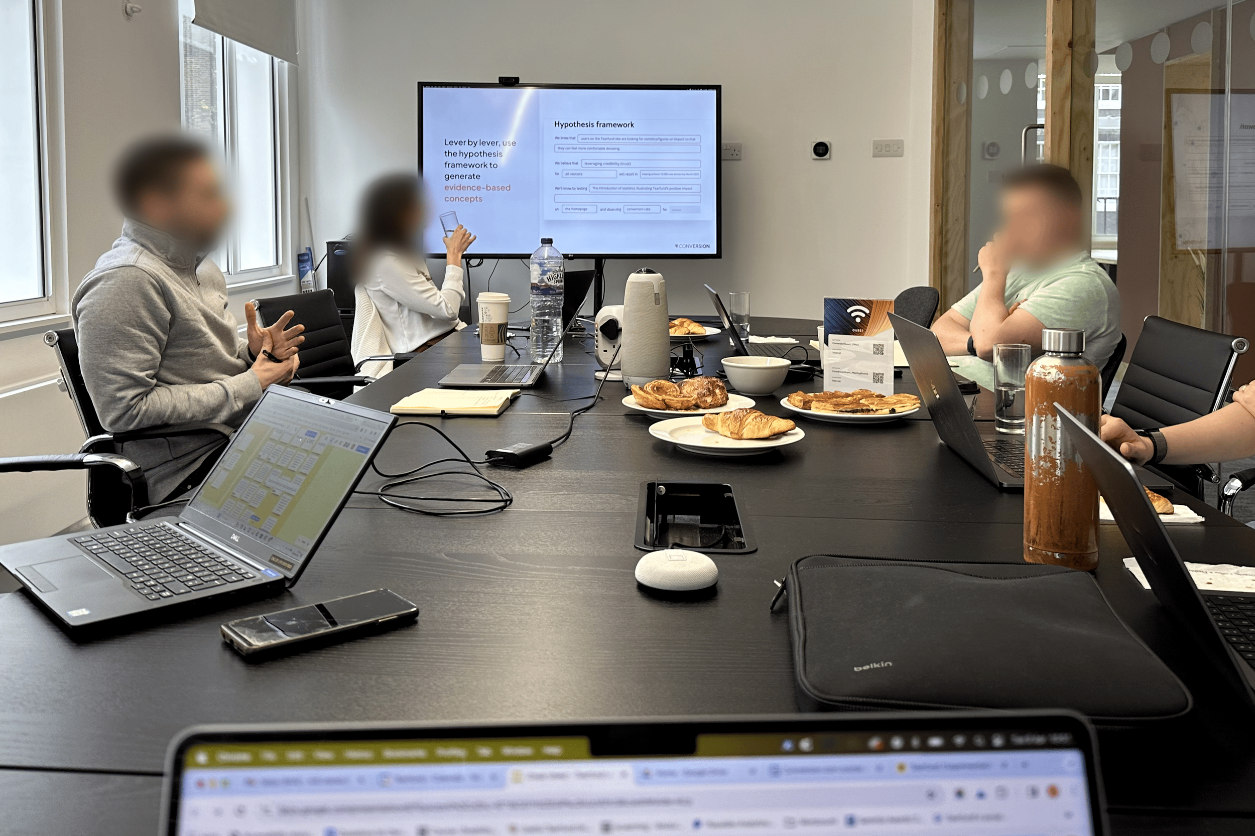
I completed an in-depth, 5-session course on A/B testing and experimentation led by Conversion.com, growing my knowledge in this area in a practical, hands-on way.
Action /
Multiple rounds of usability testing were key in avoiding the accessibility and usability issues that had plagued our previous forms. Even after following best practices and multiple co-design sessions, each round of testing highlighted a wealth of insights we hadn’t foreseen - which is why it’s such a crucial step.
Observations / What worked well
Really liked the suggested amounts on the giving widget.
Commented on how simple they found the form to complete.
Found the pre-filled fields on the form really useful.
Appreciated the error message wording.
Observations / What needed addressing
Error: Formatting on the date field doesn’t accept the full year.
Form content wasn’t specific (Covid appeal didn’t mention covid at all).
Multiple participants questioned why we were asking for their address.
Initial display of direct debit options not legible without zooming in.
Missed second GiftAid tick box, meaning we are missing out on that income.
GiftAid section slowing down and confusing multiple participants.
"Overall, the form was clean. It had the required information that you needed. Simple and straightforward. Not overly complicated. Address finder was nice and worked well.”
Testing participant


Increasing GiftAid /
The GiftAid section was a key area of focus as multiple variations of the design kept tripping participants up in testing - confusing many and frustrating some. Even for those who successfully filled it out, it was slowing them down.
Every GiftAid donation is worth 25% more in income to Tearfund, which will be used to help those in extreme poverty, so this was a really significant issue to sort.
Scenario 1
One participant didn’t read the wording fully and took a long time to complete it. It was clear it was confusing to her, despite eventually completing it.
“Start dates are all out of sync”
Scenario 2
A second participant noticeably slowed down as they were reading the GiftAid section and struggled to make sense of the start date dropdown.
“Feeling a bit long-winded to donate with all the extra questions.”
Scenario 3
Another participant got confused with the GiftAid section and initially ticked but then unticked it by mistake and didn't notice - They completed the form thinking they’d added GiftAid.
If this was on the live site, Tearfund would have received 25% less income from this donation, purely down to the confusing UI.


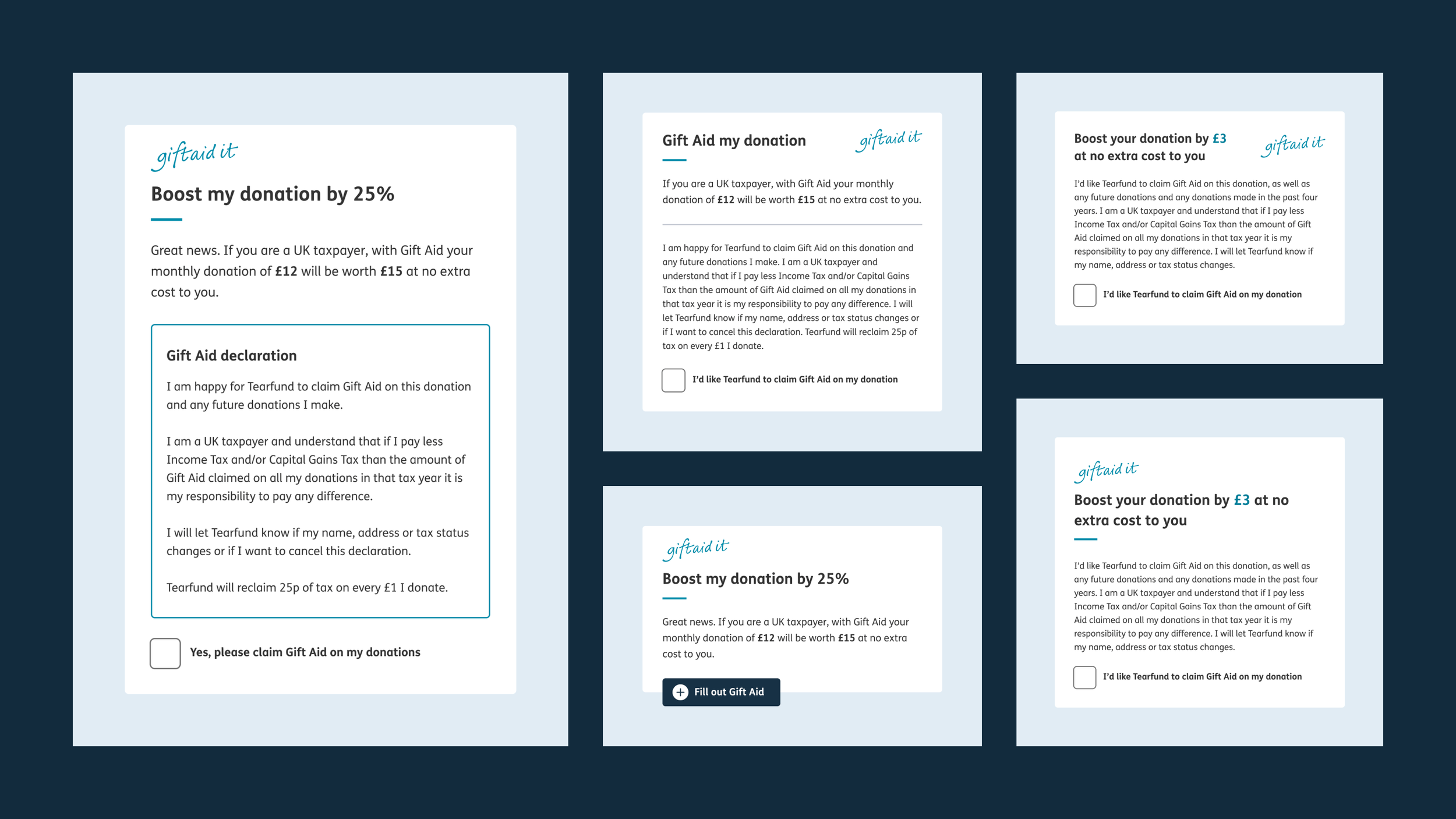
Simplifying GiftAid through testing, iteration and co-design
During each round of testing, we identified GiftAid issues and applied the ‘How might we…’ (HMW) approach to come up with solutions. I led design refinements and collaborated with the team to keep everything compliant.
I worked with Tearfund’s compliance expert to simplify the copy, focusing on what people found confusing during testing. This involved editing the existing copy myself and getting feedback on my suggestions along with the necessary sign-off. I then created several design variations using this new, shorter copy.
Using progressive disclosure to solve the recurring issues
The final design implemented a two-step process with progressive disclosure, ensuring we captured GiftAid without overwhelming users with irrelevant fields. This solution performed well in testing, enhancing speed and scannability and addressing the recurring issues.

Increasing donations through transparency /
User research revealed that Tearfund’s supporters want to clearly see how their donations are used. We saw that transparency builds trust and increases donations, while ambiguity can have the opposite effect.
I designed a highly effective ‘Where your money goes’ component
I created a new design pattern that simplified the donation breakdown from six sections to three, making the information much easier to digest. The previous version was not only inaccessible but also visually unappealing, with text embedded within a complex infographic and no supporting imagery. In contrast, the new design is interactive and fully responsive across different devices.
"I like the pound breakdown - nice visuals generally. I like the clarity of the visuals, the diagrams, the fonts - it's all very clear and not wordy - straight to the point."
Testing participant
The initial rationale behind the content and layout choices
The updated layout uses positive imagery to reinforce the message, showcasing the most compelling statistic - funds allocated to project work - as the default option, visible on page load. Users can then easily click to view how much of their donation contributes to fundraising and administrative costs.
I chose to structure it in this way because research showed supporters are most concerned about the direct impact of their contributions. While fundraising and administrative costs are essential for any charity’s operation, they aren't the primary motivators for donations.


Feedback from testing was universally positive
“It even tells you where your money goes.”
"This is helpful and what I was looking for. Nice little breakdown. Clever way of doing it."
"I love the ‘Where the money goes’ part. Good facts."
“It's important to be able to see where that money goes and what it goes towards.”
"This would be the final tick in the box for helping me decide to donate".
A/B testing helped us maximise the value of this component
Through our ongoing A/B testing program with Conversion.com, we found that simple design tweaks to the component - including repositioning it higher on the homepage - led to a significant increase in revenue per user.
I played a key role in the A/B testing project, contributing my expertise in UX and accessibility. Alongside creating the original design pattern that served as the foundation for the testing, I provided detailed feedback on the design iterations developed by Conversion.com’s designers.
My input included creating mockups, sharing important historical context about previous UX learnings and decisions, and outlining specific accessibility requirements to ensure that all live designs met the WCAG 2.1 AA standards that Tearfund had committed to.
We achieved an impressive 22.46% uplift in revenue per user through A/B testing ‘Where your money goes’ design variants
Using data to improve the giving widget /
The giving widget is a crucial part of the donation journey, often serving as the first step once a supporter has made the decision to make a donation, helping them decide on initial choices such as amount and frequency and taking them directly through to the donation form.
It presents several options tailored to the specific needs of each campaign:
Monthly/one-off
Suggested/custom amount
Restricted/unrestricted fund
With/without imagery
Emergency appeals
Seasonal appeals
Iterating based on HotJar data and building in flexibility
Given the importance of the giving widget, I conducted thorough testing beyond just usability testing. I leveraged HotJar data, including heat maps and click maps, to ensure that actual user behaviour matched the design intent.
One key improvement from this was adding a tick to the selected monthly/one-off donation choice. This addressed the fact that, unlike the giving amounts which have an arrow, this choice doesn’t have visual indicators. By adding the tick, users could clearly see which choice was selected, without relying solely on colour.
After identifying a design that excelled in both testing and analytics, I created the design variations needed to meet the diverse needs of Tearfund's campaigns.


Framing suggested donation amounts to reduce the perceived cost /
Another successful test ran as part of the A/B testing program with Conversion.com involved tweaking the suggested amounts so that they included a breakdown of the daily cost to the supporter:
£12 was reframed as £12 (39p daily)
Designing this feature was a UI challenge due to the increased content in a small space. It needed to perform well on screens as small as 320px. The initial designs were visually complex, which risked cognitive overload.
After exploring various design patterns and copy approaches with Conversion.com’s designer, I created a Figma mockup that saved space by using brackets in the copy. This solution not only resolved the responsive design issue but also performed well in testing.
Reducing the perceived cost resulted in a 20.09% uplift in revenue per user
Adding custom content to forms /
At launch, I chose to use a one-size-fits-all branded graphic on all forms. With hundreds of forms to migrate, this approach allowed us to meet the deadline without creating bespoke imagery for each form.
I also deliberately excluded a free-text section in the form builder at launch. In the past, forms had been a bit of a free-for-all, resulting in too much variation in length and structure, which led to inconsistent user experiences. By including only the copy and form fields that were strictly necessary, the form pages became much shorter and quicker to complete.
Adding bespoke imagery for a more seamless experience
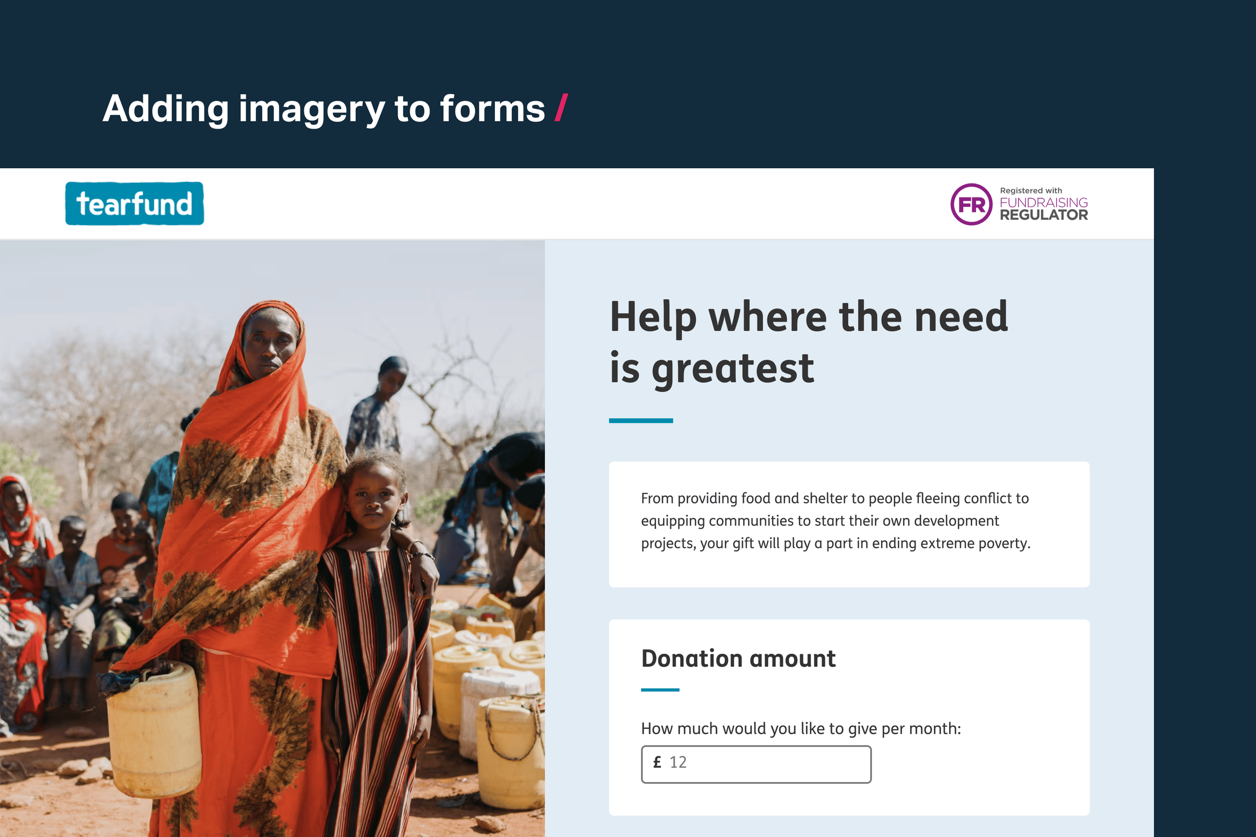
After launch, when capacity allowed, I introduced the functionality of allowing custom images, allowing us to maintain a consistent look and feel across individual fundraising campaigns. These visuals enhanced brand identity, created an emotional connection with users, and reinforced calls to action, driving higher conversion rates.
I created Photoshop templates for content creators, highlighting safe areas for placing their subjects. Uploaded images were automatically cropped and resized, simplifying the process significantly. Rather than creating multiple images as had been done previously, one image now worked perfectly across all screen sizes.
Adding bespoke copy to orient and provide context
While the forms were now more streamlined, testing indicated that some could benefit from tailored introductory copy to provide context and reassure users they were in the right place.
After launch, I added an optional free-text section at the beginning of the forms. This enhancement addressed usability concerns without significantly increasing time on page, which had been one of my initial worries. Implementing this post-launch also allowed me to develop guidance for content creators.

Result /
During my six years leading UX and UI at Tearfund, we experienced several years of record income. The redesigned website was a key channel for enabling donations, with various donation journeys fulfilled through it. The number of journeys grew during the pandemic when predominantly offline options, like in-memory giving, were forced online.
My redesign of the giving widgets and form pages improved the user experience by removing long standing usability issues, reducing time on page, and increasing conversion rates. The new forms met WCAG 2.1 AA standards, as validated by an external accessibility audit by Hassell Inclusion. Producing these forms was also much quicker.
The work I did to simplify Gift Aid increased the number of donations completed with Gift Aid applied. For each of those donations, Tearfund received 25% more income.
The A/B testing program with Conversion.com significantly increased revenue per user in several tests and, perhaps just as importantly, highlighted when changes made designs less effective, which could decrease revenue.
Over 20% increase in revenue per user in several of the experiments with Conversion.com.
Improved form metrics: Time on page, conversion.
WCAG 2.1 AA met and multiple usability issues fixed.
Significantly quicker form production process.
25% more income with every GiftAid donation.


Learnings /
The value of a good design system
Optimising Tearfund's forms highlighted the benefits of using a component-based system. By moving away from bespoke forms, we ensured that improvements made to a component automatically applied to every form across the site, maximising the impact of our optimisations.
Progress over perfection: Some fixes are beyond your control
Issues with Tearfund’s external payment provider were out of scope but heavily affected donation conversions. While I improved the number of users reaching that external page, the problems at the final step remained. What I could do was inform the Product Owner about the limitations of our current provider.
Learnings from other organisations might not apply to yours
I was eager to test a stepped form against our single-page approach, inspired by GOV.UK’s success with stepped forms. However, A/B testing during the Conversion.com project showed no improvement, so we kept our current approach and avoided unnecessary development work.
Knowing best practices means you’re not starting from zero
Before redesigning the forms, I researched the GOV.UK approach, top-performing form patterns, and accessibility standards. This meant I wasn’t starting from scratch and avoided common design pitfalls. Instead, I could focus my time on solving issues specific to our audience, rather than fixing basic form problems.
Co-designing can help when challenges seem unsolvable
When simplifying GiftAid, I was initially told some elements couldn’t be changed. However, by involving decision makers and highlighting the usability test results, I secured their support and co-designed better solutions with them. This allowed us to address previously untouchable areas.
