In-depth case study
Designing an efficient, scalable design system and 2 large charity websites
I created a design system from the ground up and led a successful redesign of Tearfund’s websites, improving accessibility, engagement, conversion, and efficiency.
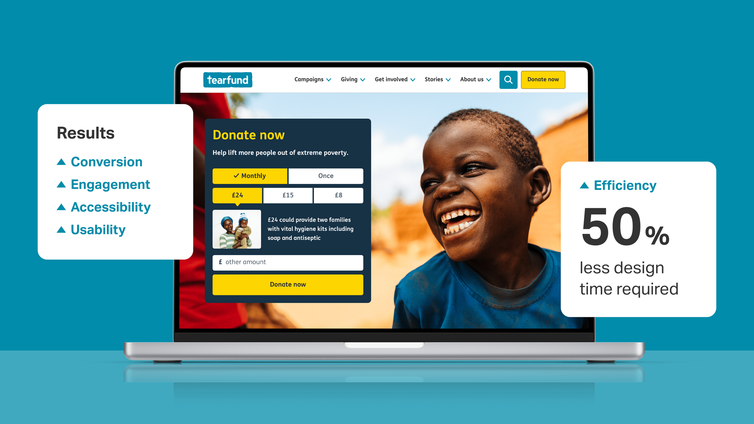
The design system I created made use of components, image templating and automation to significantly speed up the production process.
My role
As Principal UX Designer, I led the design on this project, working as part of an agile scrum team and collaborating closely with an external user researcher.
Core team
Designers x3
Developers x6
Digital Producers x2
Product Owners x2
Delivery Managers x2
User Researcher
My input
Design leadership
UX and UI design
Design systems
Rapid prototyping
Usability testing
Accessibility

Everything, from the aesthetics of the rebrand to the information architecture behind the sites, was rooted in research and tested with users.

A selection of live designs from the Stories section of tearfund.org. Left: Banner section. Middle: Image caption and intro. Right: Filtering system.
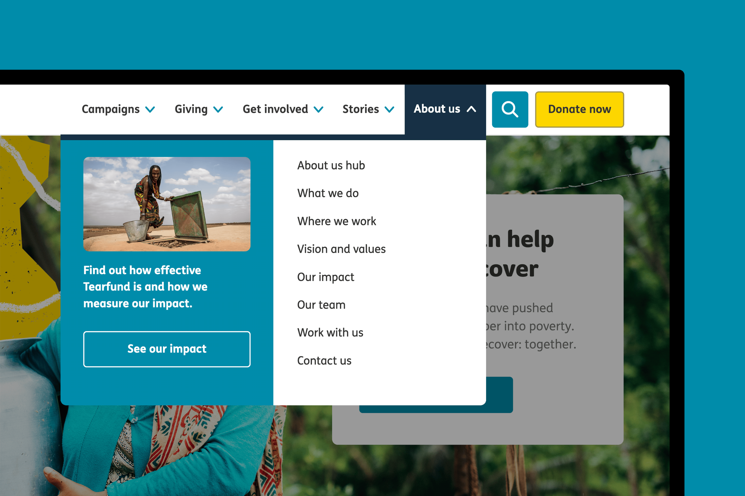
This dropdown menu was based on a card sorting workshop with external participants. It went through several iterations based on usability testing.

Optimising the experience for different screen sizes was key. While most visitors used mobile, the majority of donations were from desktop users.
About Tearfund
Tearfund is a large international development charity, operating in over 50 countries, with an annual income of £85 million. Their mission is to bring an end to extreme poverty.
The project in numbers
1 design system
2 websites
4 languages
28 internal teams
3,500+ documents
11,000+ web pages
Situation /
Tearfund’s existing websites and processes needed improvement to effectively reach and grow their audience, and ultimately drive greater impact.
Problems for the target audiences
User journeys had been heavily based on assumptions, not research.
Content was often print-first and business-led, lacking engagement.
Known usability issues were negatively impacting the user experience.
Site performance was poor and responsiveness was not considered.
55% of pages were found to have significant accessibility issues.
Problems for Tearfund
Success in meeting digital KPIs fluctuated greatly from project to project.
Digital development was inefficient and not cost-effective.
Content creators lacked appropriate guidance and templates.
Brand guidelines were print-focused and neglected digital best practices.
Bespoke, single-use designs prevented iterative global improvements.
The opportunity
Simultaneous rebranding and replatforming projects created the ideal opportunity to reinvent Tearfund’s online presence, using a holistic approach.
An agile scrum team was formed to deliver this digital transformation and an external user researcher was brought on board to lead discovery.
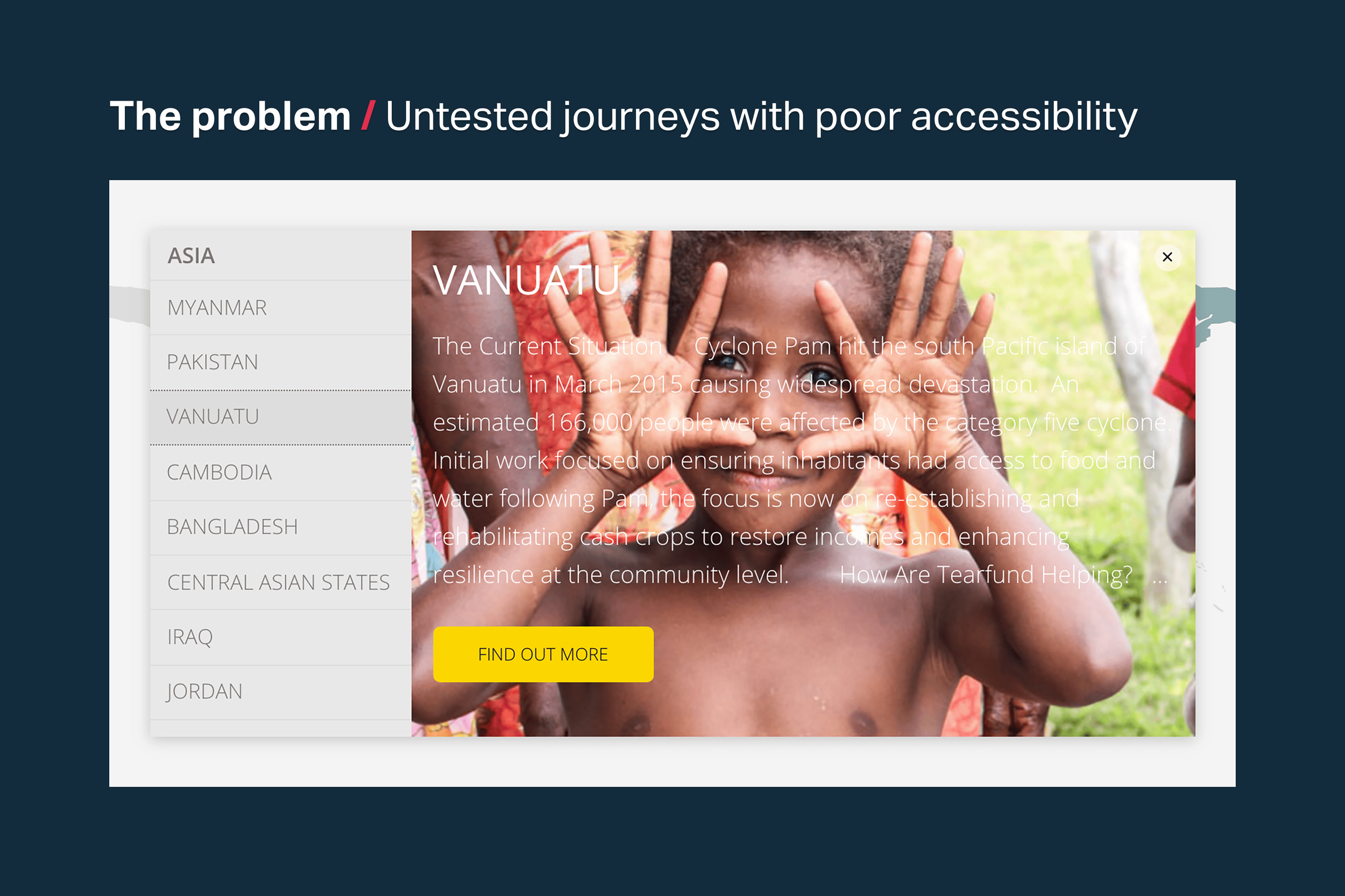
A live design with significant accessibility and usability issues. Designs like this didn't follow best practices and hadn't been tested with users.

The current development approach was inefficient, with little thought given to reuse. Design decisions were often subjective or led by aesthetics.
Task /
Deliver a user-centred redesign of Tearfund’s websites and establish a digital design system, driving efficiency and boosting user engagement and conversion.
Establish a digital design system and improve processes
Design a new, fit-for-purpose digital design system for the organisation. Build a library of reusable components that are accessible, responsive, intuitive to use and validated through user testing. Create guidance, tools and templates for digital content creators.
Tearfund values every donation, and good stewardship of that money is essential. Improving digital processes will help every pound donated to have a bigger impact and free up internal capacity for new and more effective fundraising initiatives.
Lead a user-centred redesign of two websites
Use extensive user insights to design experiences that effectively meet real audience needs and further Tearfund’s mission of ending extreme poverty. Lead the design phase, including wireframing, prototyping, testing and iteration, creating final design files, developer handoff, quality assurance and ongoing post-launch improvements.
Work closely with the Graphic Design team to develop a new brand identity and ensure an effective digital outworking of the rebrand. Use my influence within the organisation to advise on digital considerations and help steer decisions.
Website 1
Tearfund.org /
Enable UK supporters to engage with and support Tearfund’s mission - focused on unrestricted donations.
User journeys
Donate to Tearfund*
Leave a gift in your will
Give in memory
Become an institutional donor
Fundraise
Volunteer at events
Campaign with Tearfund
Read stories of impact
Apply for a job
Website 2
Learn.tearfund.org /
Empower international development workers with the latest information and resources, in multiple languages.
User journeys
Get resources
Take an eLearning course
Buy printed publications
Read Footsteps magazine
Listen to podcasts
Join a community group
Connect with your peers
Discover events
Partner with Tearfund
*For more a more in-depth look at this journey, see Form design: Increasing conversions through A/B testing and iteration
Action /
I led the design phase of this project using a collaborative and user-focused approach, designing both websites and the robust new design system that underpins them.
This case study will be focused on tearfund.org
I designed both websites simultaneously using a new component-based design system, but for this case study, I’ll focus exclusively on tearfund.org. This will hopefully allow for a clearer and more focused narrative. All supporting imagery and examples will be from tearfund.org, while my work on Learn.tearfund.org will be addressed in a separate case study in the future.

These recently created user personas - based on extensive audience research - were an essential tool that I used throughout this project.

Personas helped with ideation and decision-making. Certain journeys were tailored to a specific persona and others used a combination.
My role in the discovery phase
I played a key role in shaping tearfund.org’s navigation, user journeys, content templates and copy - maintaining a user-centred approach throughout.
I observed in-person testing of the existing online journeys. And I participated in various workshops, including:
Audience mapping
Experience mapping
Content modelling
These activities provided crucial insights into user needs, behaviours, and pain points, informing our design decisions.
I helped create the sitemap based on insights from external card sorting exercises. This ensured that the information architecture, headings, UI, and navigation aligned with user expectations.
One of my first actions was to form digital design principles
I led a series of workshops across the organisation to agree on a set of guiding digital design principles, which would act as a compass and shared vision for our digital designs going forwards.
These principles had weight to them, as they were created collaboratively and secured the backing of senior leadership.

Left: Workshop slides. Right: A poster promoting the new principles. This was early in the project when the old branding was still in use.
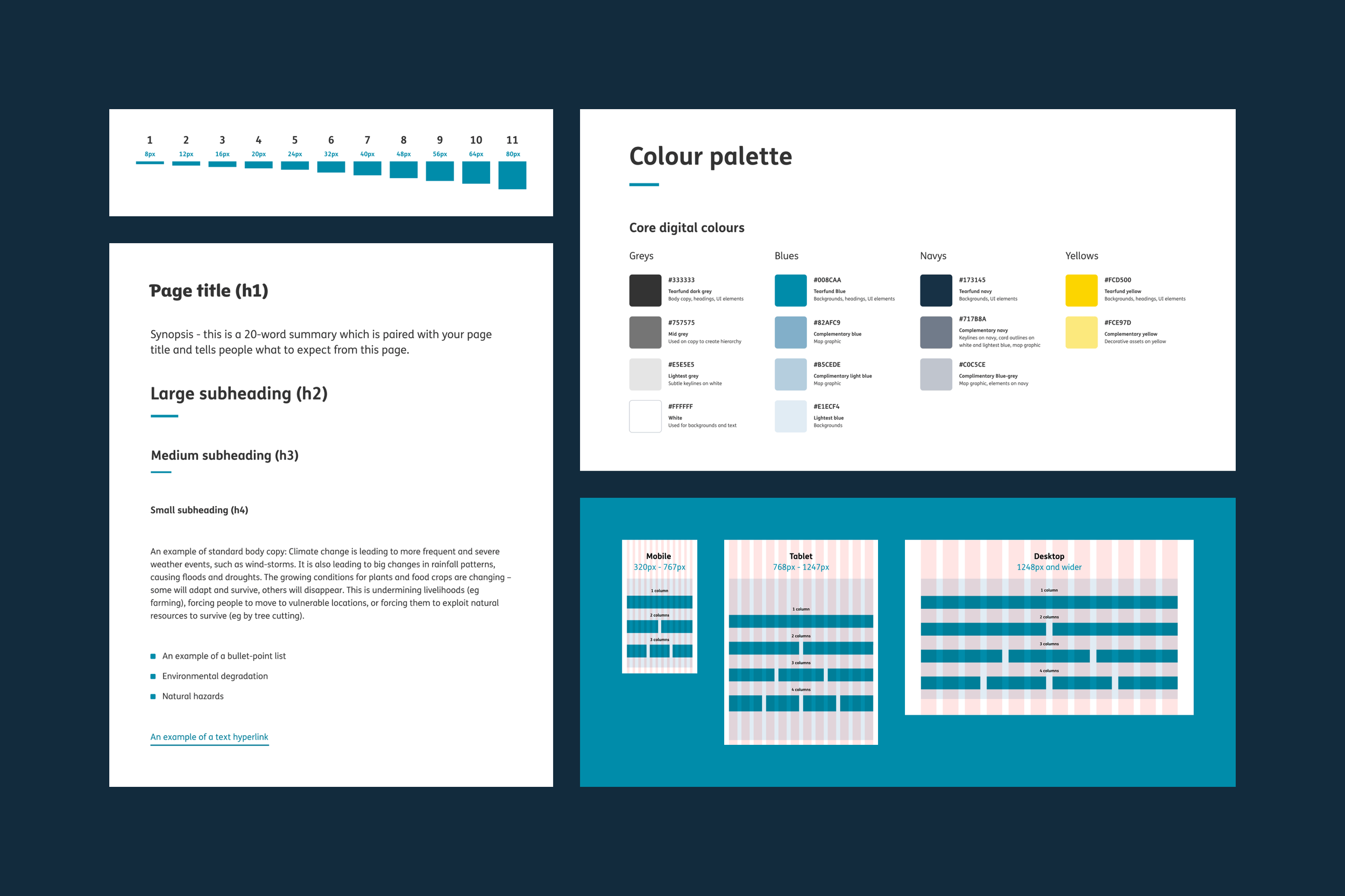
Core elements in the new design system - such as spacing, fonts and colours - were developed in tandem with the rebranding work.
Influencing the digital rebranding work
I worked closely with the Graphic Design team to shape the new visual identity, leveraging my background in graphic design and expertise in digital design.
As the leading digital voice on this project, I ensured accessibility and digital considerations were prioritised from the outset, significantly influencing the final outcome.
Misaligned timelines threw a spanner in the works
Timelines posed a challenge, as the rebranding and replatforming projects ran concurrently but ended up with different deadlines beyond my control.
A plan was proposed to redesign and launch the replatformed websites under the old brand and then reskin them post-launch, which would have compromised the possible design solutions and incurred significant additional costs.
However, by leveraging my relationships with key stakeholders I was able to secure early sign-off on digital elements - a strategic move which avoided the additional costs and allowed us to launch with the new brand from day one.
Managing other designers and facilitating co-design sessions
I managed other designers, both internal and external, briefing them and collaborating closely to create new design patterns, wireframes, interactive prototypes, and high-fidelity, pixel-perfect designs.
I led various co-designing and ideation sessions with a diverse group of internal staff, encouraging a collaborative culture where everyone could contribute and add value.
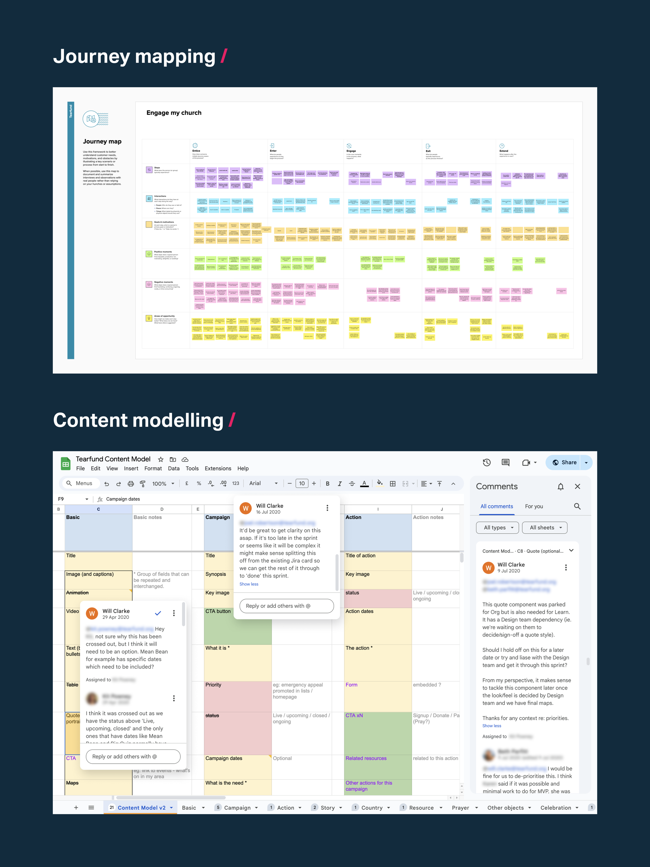
Top: One of the journey mapping workshops I ran. Bottom: A few comments that demonstrate my collaboration on the content models.

I ran remote tests on UsabilityHub to improve the designs and content. This example is testing top-level messaging with a cold audience.

I used a prioritisation matrix to make next steps from my workshops actionable, then turned them into JIRA tickets in the backlog.

I briefed new content requirements as they surfaced and worked with a copywriter to improve key microcopy throughout the site.

I ran content wireframing workshops for key pages. I've found this helps us to be content-led and not distracted by aesthetics.
Creating wireframes and prototypes for testing
Using up-to-date audience personas and insights, I worked with the user researcher and key content roles to map content to appropriate design patterns, ensuring they fit the specific needs and user flows of each site.
Creating wireframes and prototypes for testing was no small task, as they encompassed two large-scale websites with very different purposes and numerous, often complex user journeys.
I worked hard to make the new component-based system simple and maintainable - minimising the number of components needed and reusing components across both sites where appropriate.
Leveraging my copywriting skills to get better user insights
With my background in editorial design, I’m confident writing copy. This is a skill that’s been invaluable throughout my career and has helped me collaborate effectively with content teams.
I strive to be a T-shaped designer, and content is one area I’ve been intentional about developing.
I’ve invested time in learning how to write accessible, effective content for the web and I completed Content Design London’s 2-day Foundation course in 2024.
Unlike many designers, I avoid using generic ‘Lorem ipsum’ placeholder copy, as I’ve learned that feedback and insights are far more valuable when the content being tested is representative of the final user experience.

A selection of mid-fidelity wireframes for tearfund.org. I'm primarily interested in content and layout at this stage, not aesthetics.

For this wireframe of the 'campaign page' template, I used content from a past fundraising campaign, 'The Mean Bean Challenge'.
Leading usability testing
I played a key role in usability testing for tearfund.org, which included:
Writing a comprehensive test script
Advising on participant recruitment
Facilitating 1-on-1 testing sessions
Synthesising observations
Ideating solutions using How might we (HMW) exercises
Defining next steps using a prioritisation matrix
The website prototypes went through four rounds of remote usability testing, each with a minimum of 5 participants.
Using this iterative approach we were able to very quickly improve the usability and content, without wasting development time on untested designs.
This was a first for Tearfund and a fundamental change in their development approach.

I created this test script and worked with the team to refine the wording, ensuring we avoided leading questions and gathered meaningful insights.

I led 1-to-1 testing sessions and captured observations with the team, which were later grouped in a workshop to highlight key issues.

We prioritised issues as a group and used 'How might we...' to ideate possible solutions. We then voted on the best idea/s to make actionable.
Delivering the high-fidelity designs
After several rounds of testing and iteration, I led the delivery of the high-fidelity designs, which involved creating designs as well as overseeing other designers’ contributions - ensuring every output met our standards.
Working in 2-week sprints allowed me to maintain a steady flow of components for the developers to build.
The final design files were easy for the developers to understand and work with. And they benefitted from my strong attention to detail, with pixel-perfect spacing, focus states, error messages and edge cases all clearly detailed.
Every component was designed at mobile, tablet, and desktop views, with additional breakpoints for complex elements like the donation widget, helping ensure optimal performance on smaller screens.
Leading developer handoff and quality assurance
I partnered closely with front-end and back-end developers to ensure the live websites matched the design vision. Their early involvement helped us solve problems and confirm technical feasibility, and I played a key role in quality assurance (QA) once the builds were complete.

New components and page templates made the different user journeys - such as leaving a legacy - easier to produce and more consistent.

The footer was contextual, with the main footer (left) changing to a form-specific version (right) during donations to provide relevant info.

Navigating using cards tested well with users, so I developed a robust card system - featuring optional imagery and customisable text fields.

Migrated content meant I needed to build in flexibility to the new components - while setting wordcounts and guidelines for future content.

With every page built with components, the entire site could now benefit from future iteration. For example, an ongoing A/B testing program.

The new websites met WCAG's AA level of accessibility, confirmed by an external audit. This includes focus states, as demonstrated here.
Documenting and embedding the new design system
I delivered the new design system and took responsibility for its ongoing development post-launch. The system was not static, and was continually improved and iterated on, based on live data insights, new requirements and user needs.
The documentation and guidance were hosted on a new online brand portal, developed by an external agency. I was in charge of the digital section, collaborating with various teams to ensure comprehensive and user-friendly documentation.
This included the following:
Component library
Grid and spacing, typography, colour palette, UI icons
Digital design principles
Content guidance and word counts
Glossary of digital terms
Photoshop image templates

An online brand portal documented the new design system. This included key elements like user personas and in-depth component guidance.

Component guidance included visual examples of each component, an explanation of what it's used for, wordcounts and links to image templates.

A design system is only effective if it's understood and adopted, so I shared examples and guidance with content creators and project managers.
Result /
The project was a great success on all counts, delivered on time and budget, meeting KPIs, vastly improving user experience and making future development cheaper.
Two effective large-scale websites were launched
The redesigned websites launched on the new CMS, on time and on budget, meeting key metrics for engagement and conversion. They also saw a significant SEO boost, driving more relevant traffic and higher visitor numbers.
Well-tested user journeys were further improved through iteration
The user journeys across both websites were grounded in extensive research and had benefited from multiple rounds of testing, giving us a high degree of confidence in their effectiveness.
Post-launch, data insights from analytics and heat mapping tools like HotJar allowed us to monitor and refine the designs further. The component-based approach ensured that new learnings could be quickly applied across the sites, rather than on a case-by-case basis.
The new websites met WCAG 2.1 AA accessibility standards
Tearfund made a significant leap forward in accessibility. The new websites met WCAG 2.1 AA standards as well as many AAA standards - validated by accessibility specialist Hassell Inclusion.
This project sparked broader organisational changes, including a commitment to WCAG 2.1 AA standards, incorporating accessibility requirements into creative briefs, and initiating a new workstream to improve the accessibility of printed collateral.
Average page load speeds were more than halved
Performance improvements across all devices and browsers saw significantly faster load speeds, with many pages loading up to four times faster.
Design capacity required for new imagery was reduced by over 50%
The new one-size-fits-all approach to imagery, using templates and automation, cut production time in half and empowered non-design roles, like copywriters, to quickly and easily create high quality imagery.
Expensive outsourcing was no longer necessary
The new design system delivered substantial cost savings. The component-based approach, guidance for content creators, and process optimisations made future development far more efficient and sustainable for Tearfund.
The time and expertise needed to produce new pages decreased, while quality, consistency, and effectiveness improved. The in-house development team could now deliver projects independently, eliminating the need for costly outsourcing.

I worked closely with a front-end developer to ensure simple, performant designs, as these impressive Lighthouse scores help illustrate.

My design approach prioritised readability, which boosted engagement. Average scroll depth for story pages like this was significantly improved.
Learnings /
Use data and insights to inform decisions
User-centred design isn't an exact science, and differing views and interpretations are bound to occur. User testing is crucial for guiding decision-making, by providing objective, user-led insights.
Embrace a culture of continuous learning
A team culture where it's okay to say 'I don't know yet' - where learning is both expected and celebrated - is so valuable. It makes work more enjoyable and inevitably leads to better outputs.
Find allies who can help spark change
Connecting with like-minded colleagues who share your passion is a powerful way to drive change. As well as offering each other support, your collective message is amplified and more impactful.
Thanks to /
Tony Brazao, Toby Dipper, Kevin Etchells, Hannah Graham, Charlene Hayden, Lloyd Kinsley, Isaac Lemon, Jordan Mary, Agnes McGrane, Jon Morgan, Beth Parfitt, Ed Pilkington, Kit Powney, Vaneeth Roberts, Joel Robertson, Karen Shaw, Katie Tang, Adam Tomat, Helen Triggs, Clara Vernon, EDO, Hassell Inclusion, Nemetos, Rareloop.
